Episode 10: Laura Allred Hurtado on curating contemporary Mormon art

Show Notes
In this episode, Mormon Artist podcast host Katherine Morris interviews Laura Allred Hurtado, global acquisitions curator of art in the LDS Church History Department. Laura discusses several Mormon art exhibits she’s curated: Practicing Charity: Everyday Daughters of God for the Church History Museum; Love Hours for the Alice Gallery; and Mondo Mormon: Cristo, Cumorah, and the Celestial Style and Church vs. State: Contemporary Collecting Praxis for the Utah Museum of Contemporary Art.
- Interview date: February 27, 2015
- Exhibits:
- Note: Podcast music and sound by Saint Roxcy. Copyright © Saint Roxcy 2015. All rights reserved.
Transcript
Katherine Morris: Welcome to the Mormon Artist podcast. I’m your host, Katherine Morris. Today we’re speaking with Laura Allred Hurtado. Hi, Laura!
Laura Allred Hurtado: Hi!
Katherine: Laura Allred Hurtado is the global acquisitions curator for art in the Church History Department. She has an MA in Art History and Visual Studies from the University of Utah, and a BA in Art History and Curatorial Studies from BYU. Laura has presented papers at scholarly conferences and curated exhibits at the Utah Museum of Fine Art, the Utah Museum of Contemporary Art, and various other venues.
So, Laura, you’ve curated a number of shows featuring or including Mormon art for the church history museum and the other museums mentioned, such as the Utah Museum of Contemporary Art, so I’d like to discuss some of those shows. In 2013, there was a show at the Utah Museum of Contemporary Art called Mondo Utah: the Utah Biennial, and there was a part of that show that featured Mormon work called Mondo Mormon: Cristo, Cumorah, and the Celestial Style. So, first I just want to ask how you got involved in that particular show.
Laura: Sure. Aaron Moulton who is now at Gagosian Gallery in L.A. was the curator of UMOCA at the time, and he organized an exhibition—biennials are really common and very popular right now, and they can be thought of as sort of micro-international centers of the art world. Whereas you think maybe of New York being the center of the art world in the 1950s or Paris in the 19th century, these art fairs are these international exchanges where people come from all over the world to show the cultural production that’s going on.
Aaron wanted to take that concept and look at Utah as a microcosm that has all these little tiny art worlds within it. So, it was an art fair for the state of Utah, but it was an invitational. So, it was looking at some of the collections in the state. It was at UMOCA, but that was formerly known as the Salt Lake Art Center, and it was a collection institution, so they showed some of the works from that permanent collection.
Anyway, I was invited to represent the Church’s collection, or Mormon art. I thought of my area as—I often shorthand referred to it as the “Mormon Pavilion.” That was in part in reference to the tradition of World’s Fairs in which Mormons would participate in World’s Fairs starting in—I believe it was 1833 with the Chicago World’s Fair. A lot of our visual heritage comes out of the World’s Fair, so I wanted to plan on that.
Do you want me to talk about the works that were included?
Katherine: Yeah. Some of the artists that I noticed were Annie Poon. She had her Book of Visions. She does paper animation, and that was a film, a short film, her Book of Visions. Was it the film that was playing or was it the papers that she had—
Laura: Yeah, it was the film. I wanted to think about the way that there are Mormon artists that are engaging with the contemporary aesthetic practice, and even referential towards the larger contemporary ideas, but at the same time exploring religious notions.
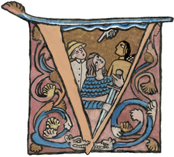
I showed Annie Poon’s video, and I thought as it relates to exploring the notion of visions, which is super interesting—but it also is quite similar, although aesthetically different to William Kentridge, who shows at MOMA and all over the place. I like the notion of this kind of rudimentary animation that’s in her work.
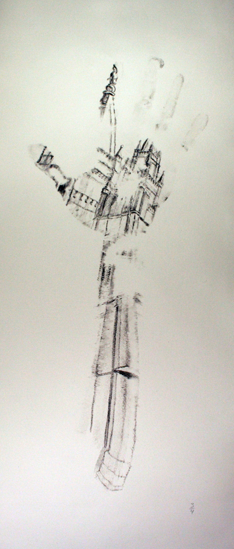
And then I included David Chapman Lindsay, who does these really smart pieces where he draws on his hand and then uses his hand as a printmaking material and comes up with maybe three prints in addition using printer’s ink. The cool thing is that oftentimes for this series that he produced for the Mondo Mormon exhibition, they were all tied to stories that had to do with touch. Like the woman who touched the hem of Jesus’ robe to be healed, or even one of the ones we had in there was of the Salt Lake Temple. So much of the legacy and dialogue around the temple has to do with the labor and the hands that built it for forty years, and so that very much is tied to that notion.
I had work by an artist named Stephen Moore, who did these pieces called Healing Blessings, and in some regards they’re kind of performative where he would leave them at places like crash sites or when people were going through cancer—there were these sort of tokens of healing, and that kind of ritual felt very akin to performance art, but it also seemed to make reference to the story of Joseph Smith sending a handkerchief in Nauvoo when there was the malaria outbreak, so I liked that kind of duality to it. It references the religious ritual or religious practice and a kind of performance art practice.
Another piece that was in there was J. Kirk Richard’s Cristo series.
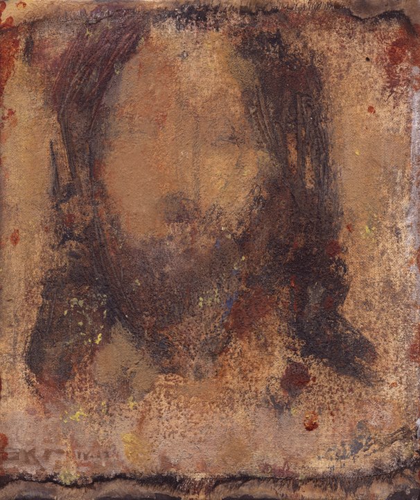
I had heard about this series when I attended a conference, an Association for Mormon Letters conference, and there was a paper presented about it. At the time he was just doing very small images of Christ. The idea was this kind of stripped, skeletal icon of what Christ looks like: the beard, and the long hair, these kind of token identifiers. But it didn’t get so obsessive over “this is what he looks like,” and I liked the notion of abstracting that—in fact it felt very strong to me.
At the same time I had seen a work by a Belgian artist named Francis Alÿs, who is based in Argentina, who had done a series called Saint Fabiola, and what he had done was he had over years spent time gathering images of the saint, and they’re all done in the same way. The side profile, she has a veil on her head, the nose looks the same—he basically just looked for folk reproductions of this image of the saint. And when they’ve become repeated over and over again, it’s kind of this notion of a simulacra, where it’s a referent of a referent of a referent, where it loses its original itness.
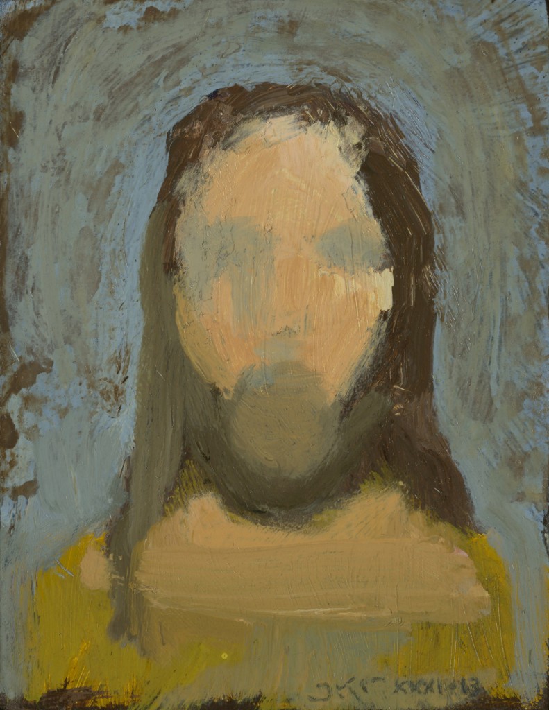
I felt like that model was actually quite important for images of the Savior, because I think it is sometimes a misstep to really create an image that claims a stake in terms of his physicality, because it masks the notion of what we know and what we don’t know, and what we can see and what we can’t see. So, I liked the notion of abstracting that.
And like Alÿs, I called up Kirk, and I said, “You have this series, you have maybe one or two. I want you to make a 150, and I want you to make it in a month, and I want it to fill a 20-foot wall. And I’m not going to pay you.” I just want you to do it, because it’s a cool idea, and it needs to be done. And he was like, “Okay, great. Cool.” We were lucky enough to be able to acquire it. That wasn’t the terms of having him do it, and it wasn’t the terms of his original idea; it was just this kind of concept and exploding his original idea. Kirk was just fabulous and great to work with, and drew out a design on paper, and then we went from there.
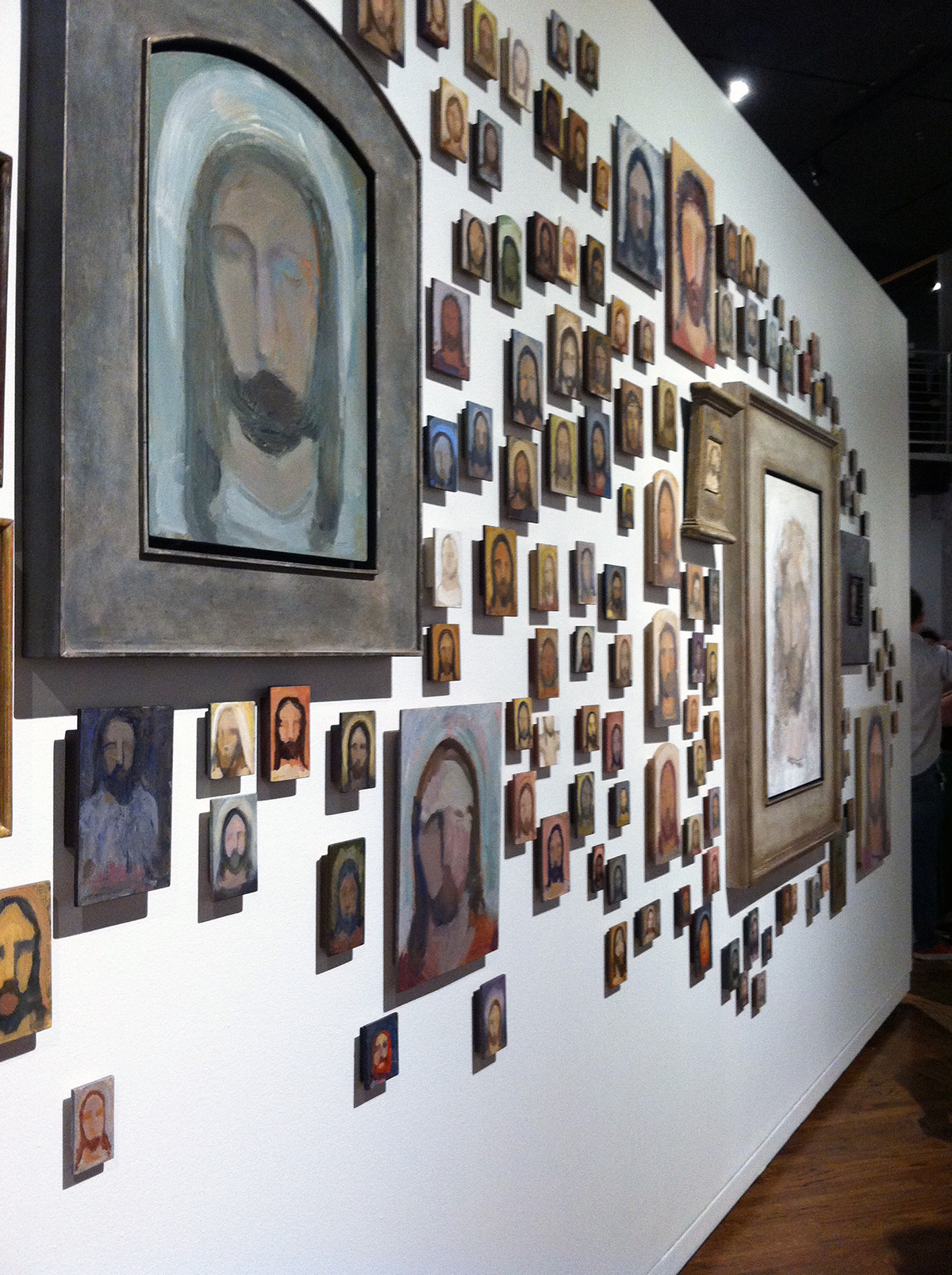
And my wall space—I had 40 feet of wall, and I gave that one work 20 feet, so it took up a good half of the exhibition space. So, that was Mondo Mormon.
The notion of “Cumorah” comes out of Annie Poon, because in the Book of Visions it’s referencing when Joseph Smith finds the plates, and the “Celestial Style” is referencing Hagen Haltern, who was a BYU Professor. He published this book called Art Integration: The Spiritual Foundation and Anagogical Level of Meaning of the Celestial Style. It was just this overly ambitious, handwritten book about how abstraction can, in the simplest terms, how abstraction can be used in terms of a cultural experience and in terms of a spiritual experience. That journey felt very much like Kandinsky for me, but it also seemed uniquely Mormon. When you’re going to call it a “celestial style,” that’s distinctly Mormon.
Because he taught at BYU, his influence isn’t just important to him, but to the artists that he worked with—Richard Gate, among one of them, and Mark England—but that you could see a kind of unifier, or echo of influence. I liked the notion of his ambitions. So, what I included was actually not his work but the manual itself, which was this great—obsession is the wrong word—but this great meditation on art and God and image-making. And I think even the notion that it is hand-written also testifies to being this personal manifesto for him. So, we included that book.
Katherine: That’s really interesting. Was that something that you’d already acquired?
Laura: It was in our collection already, and I ordered another one. The cool thing is the one I ordered from Amazon was signed, “To Bruce Smith from Hagen Haltern,” which is kind of cool—that connection there. I don’t know why Bruce was selling it, but that was kind of a cool capture.
Katherine: And for our listeners, who is Bruce Smith?
Laura: Bruce Smith is another BYU Art Professor, and he has worked in the State Collection and the Church’s museum. He’s a painter with this really cool, sometimes bordering on sort of a German expressionist style. That feels like a little too rough of a descriptor, but anyway, he’s a cool painter at BYU.
Katherine: There was a write-up of the show. You had an article that you’d written about what you call the “Mormon Pavilion,” or Mondo Mormon. You were talking about how artists in general tend to implement a postmodern (or even a modernist aesthetic), which typically deconstructs and critiques institutional authority, but for people who are producing religious art, that might create some interesting tensions because they might be coming out of this postmodernist or modernist tradition but at the same time are part of an institution.
How do you create art that examines religious observance and devotion that isn’t necessarily ironic or cynical, or at the same, on the flip side of things, sentimental? Striking a balance between those is I guess the sweet spot for contemporary religious artists. What would you say about the work in the show and what you think was working in those pieces as far as striking that balance of not being ironic or cynical, but also not being kind of sentimental or—
Laura: Sappy. Yeah, it’s a great question. I think there are a lot of people, a lot of art professionals, in Utah that have really been invested in the notion of Mormon art and Mormon visual culture. They have in some regard really been dichotomous in terms of “it’s representational art that can carry the story and there’s a fence and BYU has faltered because they’ve forsaken us because they are not making representational art. And it’s only representational art that can carry the vehicle of the Mormon story or the Mormon experience.”
There’s this sort of burden of that. And on the same coin, also from those voices, there’s a kind of vilifying postmodernism in general. I think a modernist aesthetic does lend itself to spirituality. You see Kandinsky for one; or Dali, the surrealist, did a lot of really cool religious paintings. Matisse did a Catholic chapel and worked tightly with a priest in France.
I think in some regard with postmodernism as a philosophy—it tends to deconstruct. I think what I liked about that theory or those sort of ideas manifesting in perhaps Kirk’s work is that—I think what it does quite rightly—is that it deconstructs the notion of a single image of Christ. It’s exploded into 150. In some he has black hair and red and brown. In some he has a halo, in some he has a cross, in some he has a crown of thorns.
I think that sort of multiplicity is really interesting and is really useful, because we see Christ in a variety of different ways. He has over 200 names listed in the Bible. I think that sort of multiplicity and that sort of deconstruction of a single image is actually extremely useful in this situation. Even abstracting the face—in my article I talked about how it mirrored that terrestrial fog in which we live. That we do really only access Christ in types and in shadows and in here and there and on the periphery. I think that kind of deconstruction and multiplication is very smart. And yeah, that’s how it succeeded.
Katherine: You referenced Brad Kramer as commenting on images of Christ. To paraphrase what he says, thinking of trying to find that true single likeness of Christ might not make sense when our experience is not that we’ve seen this singular image of Jesus Christ; our experience is oftentimes symbolic. It’s taking the sacrament. It’s being the body of Christ. It’s seeing Jesus Christ in other people as we’re serving. So, in a sense, J. Kirk Richard’s pieces are capturing that idea, that kind of comprehensive experience that anyone could maybe relate to or read into when they see his works.
We interviewed J. Kirk Richards last year, and this was one of the things we talked about, which also goes back to the presentation he gave at the Association for Mormon Letters, which is that it allows space for your own experience with Jesus Christ and also even maybe allows more space for revelation. That’s actually a different topic for another day!
Going back to what some artists are doing that is religious but maybe not devotional as much, or maybe is a little more, ironic or critiquing, or, on the other side, sentimental. Would you say that J. Kirk Richards’s work is postmodern and is deconstructing our experience with images that we’ve previously seen of Jesus Christ, but it’s not deconstructing Jesus Christ himself or even the institution that J. Kirk Richards is affiliated with, which is Mormonism? So, in that sense, it’s devotional—being neither ironic or cynical or sentimental—but also postmodern.
Laura: Yeah. I wouldn’t say that all of his work is postmodern, but this work, in particular, is—without being ironic or cynical. I think it’s important. I think it’s a significant piece.
Katherine: Okay, let’s move on to another show that you curated which was for the Church History museum. It’s the exhibit, Practicing Charity: Everyday Daughters of God. Is that one currently up at the Church History museum?
Laura: That exhibition closed in September. It was up from about February to September.
Katherine: But it can be seen online?
Laura: Yeah. You can see it online, which is a cool thing, I think.
Katherine: Yeah, we’ll include a link to that in the transcript and show notes.
I wanted to talk a bit about that one. In one of the write-ups that you did about the show, you talked about how it was organized around three artists—Lee Udall Bennion, Brian Kershisnik, and Kathleen Peterson. You said in an article on Juvenile Instructor that you selected them because “they consistently depict women as ennobled, while simultaneously celebrating the importance of their everyday lives, lives that in the ceremony of the everyday perform their covenants and their religion in important and symbolic ways, but they’re not painted as ideal or placed on a pedestal. Rather they’re authentic, noble, everyday daughters of God.” Tell me about putting together that show and playing with that theme.
Laura: Sure. So, I guess it just started with wanting to do a show about women. It was in part, to tell you the truth, a reaction to the Boy Scout show, which was important work. But if we were going to have a Boy Scout show, I also wanted to do one about women. So, that was the notion in mind.
I had been, when I started working for the Church, I spent a good six months just calling up artists, introducing myself, and doing studio visits. While I was in a studio visit with Lee—oh, no, it was with Brian—I remember him telling me that the very first time he had painted was in Lee’s studio. I had this thought, “Oh, that’s so obvious.” When you see their work, it’s so obvious.
Katherine: Yeah, it looks very similar.
Laura: Yeah, and it was something I had never known, and I was surprised that I hadn’t known it. Of course, Kathy lives in Spring City too. Although there wasn’t a direct mentoring link, you just see a kind of shared visual language in their work. And I think what’s also shared in their work is what you said in that quote—this notion of—and there’s a lot of women and a lot of women in dresses. I think Brian said, “You know, if you took a survey of my work or a statistical analysis, it would be 75% women or more.” So, there’s a consciousness with those three artists to depict women as subject matter.
I was interested in that, and I was also interested, as I said in that article, in the notion of this kind of meditation on the everyday. In Brian’s painting—there was one in the exhibition called “Bringing Food,” and it was just as it describes: a women bringing food. The cool thing is that it’s not clear who she’s bringing food to. It could be to a neighbor; it could be to her own table. So, there are all of these micro little meditations on the things women do and the things Mormon women do. I don’t know how many times I saw my mom bring food to a neighbor or to a friend.
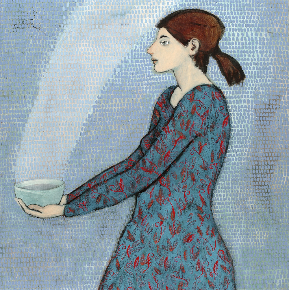
I like the idea—it was originally titled Practicing Eternity, and I think in some ways that captures the notion a little more clearly. I was thinking about the way in which we are practicing how we will live in heaven, and how that’s really plunky and archaic and not what it’s going to be. But the gist of it—whether it’s like picking up socks, or these seemingly mundane things are important service, and the service that happens every day and happens in the mundane and in the shadows.
I liked that. It was very much in all three of their works. This notion of friendship. And then also the notion of an empathetic sense on imperfection. Brian had another work called “Halo Repair.” Here’s a woman, and she’s getting her halo repaired. It’s very playful and…
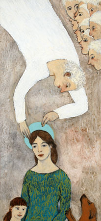
Sorry…sorry, she’s eating toilet paper. Okay, there you go. Gross.
Katherine: This is very illustrative of what we’re talking about.
Laura: Big pause for a minute while I practice charity…
I like that idea, and I think too often Mormon women feel all this need of being perfect, or a demand of performing things in weird ways—whether it’s a lovely tablecloth on the Relief Society table or I don’t know. I’m probably getting too far, but I just like this sense of authenticity in their work, and a kind of lovely meditation on the everyday.
It was well received. A lot of people come and asked me for the text labels. We tried to do a project in relation to Achievement Days so girls could come and get their Achievement Day requirements signed off by attending an exhibition or Young Women’s value signed off, like unto the Boy Scout exhibit where they could do a Merit Badge.
Katherine: That’s really neat, and we’ve talked about this before. When we talked previously before, I asked you what themes you’ve seen, because you have seen a lot of contemporary Mormon art. I asked you what themes you’ve seen popping up, and the one that first came to your mind was that theme that’s kind of reflective of Terryl Givens’s paradoxes of Mormon culture—the disintegration of sacred distance. So, the sacred and the quotidian side by side; the mundane and the sublime experienced as one.
This exhibit was illustrative of that idea, so that was really interesting that you had an entire exhibit devoted to that idea.
Laura: Even the subtitle of it was Practicing Charity: Everyday Daughters of God. It was trying to on the one hand really celebrate the work of the mundane, celebrate the importance of the mundane and the significance of it—and the sacred as well.
There’s a photograph—I may be getting ahead of myself…
Katherine: Let me introduce, really quickly, what you’re going to start talking about, and then we can talk about it. The last exhibit I wanted to talk about that Laura has curated—and she’s curated a number of shows, not all of them with Mormon art—but the one that is currently at the Utah Museum of Contemporary Art is called Church vs. State: Contemporary Collecting Praxis. So, why don’t you actually finish your thought about the photograph in that exhibit.
Laura: There’s a photograph in that exhibit that again typifies that notion of the mundane and the sublime. There’s a couple, but one is Mark Hedengren’s photograph. He re-created Dorthea Lange and Ansel Adams’s Three Mormon Town series, and it’s like some dude vacuuming the church on a Saturday, and it’s so typical Mormon practice.
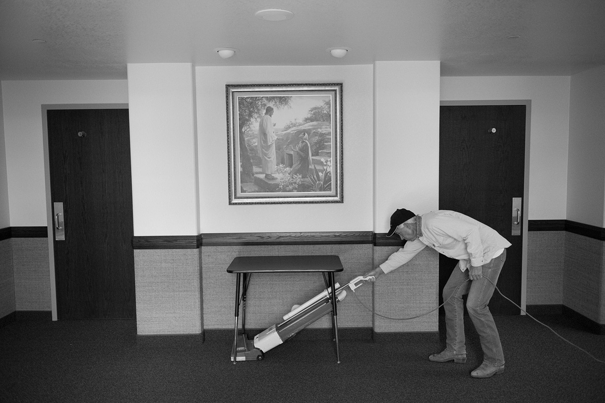
That’s the kind of devotion we have. That’s a really mundane way in which we practice our religion. I went to look at it when I was leading the tour through, and the image is a man vacuuming the church, and you see a Harry Anderson on the wall of Christ at the tomb with Mary Magdalene. It has a typical kind of itchy wallpaper they now put on walls and the typical table that is in every church and the typical vacuum that is in every church.
And Harry Anderson—you know, this is a typical Harry Anderson of Christ at the tomb. It’s the resurrection; it’s the notion of being clean again. It’s very smart in relation to physically cleaning the building. It’s a very smart mirroring in the photograph—this really mundane notion of picking up dirt and the notion of the resurrection, in being rendered and being clean again. It’s very, very smart in that regard and just super funny. Funny in the nicest sense—this high art and this dude vacuuming in it is so very smart and funny in the best ways.
I curated an exhibition that was all Mormon artists that was called Love Hours. I hadn’t thought about it necessarily as a Mormon show. It was about motherhood and looking artists’ work who had a kind of time signature to it—and how time signatures are a part of often the work you do when you try to memorex or freeze the experience of mothering. But again, it was making those hours holy. Hours like H-O-U-R-S, not O-U-R-S.
It had a piece by Trevor Southey. It had a piece by Brad Barber. It had a piece by Susan Krueger-Barber, Leah Moses, and Kelly Brooks. And then a poem by Sylvia Plath going through it.
There’s this one piece by Kelly Brooks where it’s a portrait of her and her daughter, and they’re cleaning the kitchen. So, what she did was she filmed herself cleaning the kitchen with her daughter, and then she watched it. While she watched it, she did a blind contour drawing, so it just looks like lines, but you can see very clearly what lines are the mother’s and what lines are the child’s. The mother’s lines are these clear, triangular lines, very directional, using the kitchen in a very efficient way. And then the child’s lines just kind of meander or wander. Each one has a time signature, like cleaning the kitchen at 5:06 p.m. on such-and-such a date.
These are those messy things that are a part of existing and part of just humanity, but also, in some regard, these sacred moments. So, again, there was this desire to record them for Brooks and display them for me, because they were these important moments of, just like, cleaning the kitchen.
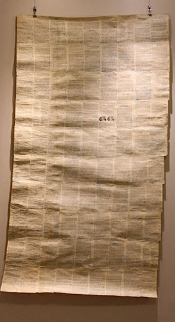
There was another [work by Leah Moses] where there was a record of what nine days of breastfeeding looked like. Every time she sat down to breastfeed, she just drew lines and then overlaid them on pages of breastfeeding. Again, there is a kind of deconstruction there of that book and that text, but also of making that work visual. It’s huge, and you think about all of the time that took—and that’s just nine days. It’s a sacrifice, and it’s an important sacrifice.
Katherine: Where was it?
Laura: It was at the Alice Gallery on South Temple. That gallery is run by the State. It’s named after Alice Merrill Horne, who was a champion of the arts in the 30s and founder of the State art collection, a Mormon herself.
Katherine: That sound like really beautiful work. I like that idea.
So, going back to the Church vs. State exhibit, I’d like to hear briefly how that came about.
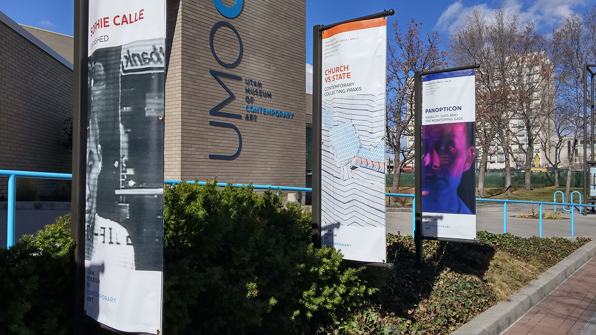
Laura: Christian Anderson is the director of the museum, of the UMOCA. He’s been there for about a year, so he wasn’t there during the biennial. He was interested in the way that institutions can shape contemporary art practices in the objects that they collect. Sure, you can study the scope of contemporary art as it is recorded in art form, or as it is recorded according to a certain arc—a linear arc, like this is the art that becomes significant or anthologized or canonical. There’s that story as it’s told through the lens of the art world, but there are contemporary arts simply because they are contemporaneous, even if they are not in dialogue with the contemporary, larger art world definition.
He wanted to kind of look and open the doors of the Church’s collection and of the State’s collection and say—because to patronize artists, because you are one of the biggest institutions that buys in the State—you therefore shape contemporary art by patronizing it. So, let’s look at the work you collect and the work that comes in and out of your institutions. One room is looking at the work in the State collection, and one room is looking at the work in the Church’s collection.
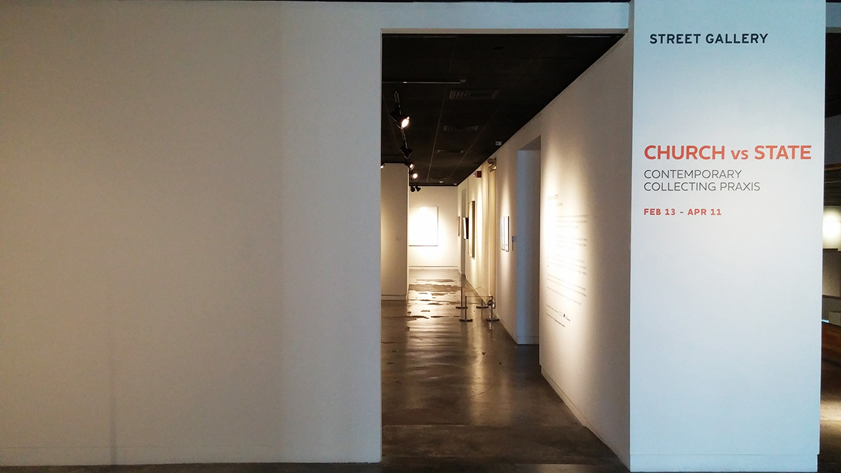
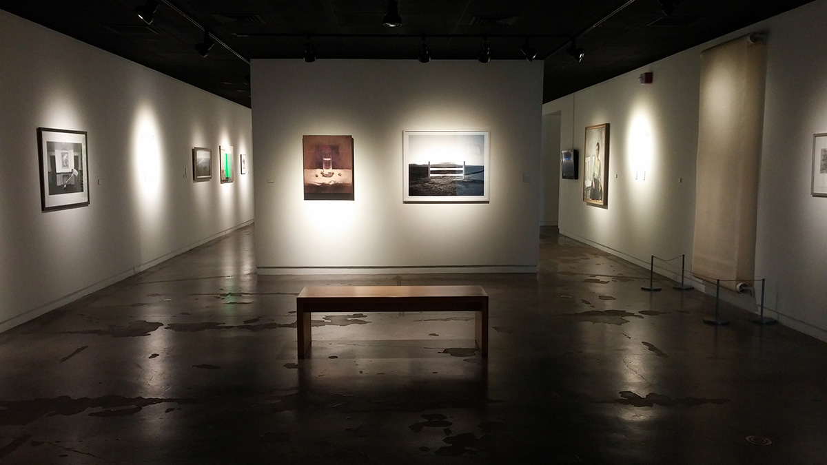
The room for the Church’s collection is all work that I have had the privilege of collecting over the last two years, so they are really recent acquisitions in that regard.
Katherine: I would like to talk about some of those. I’d like to start with a piece by Valerie Atkisson that I remember seeing, as an undergraduate at BYU, at the Museum of Art, and I was astounded. I hadn’t see a lot of, almost installation pieces on Mormon topics. It’s just gorgeous. It’s called “Hanging Family History (Maternal Line)” and it’s copper wire, rice paper, and pencil. Why don’t you tell us a little about that piece and acquiring it.
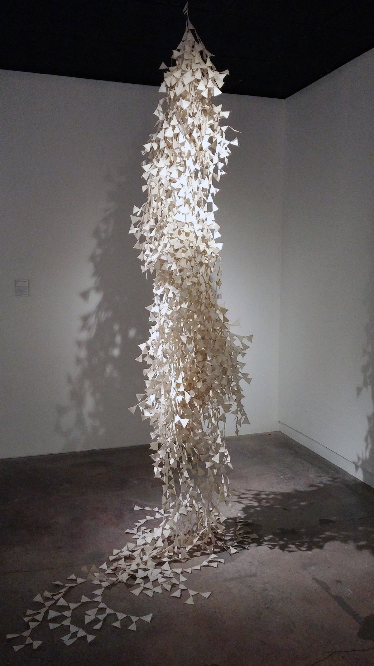
Laura: The work you saw at BYU was probably the paternal line that’s part of BYU’s permanent collection. We own the maternal line, so they’re partner pieces, but in two different institutions. That was the first major contemporary piece that I collected, and I probably was able to acquire it in about six months of being employed with the Church.
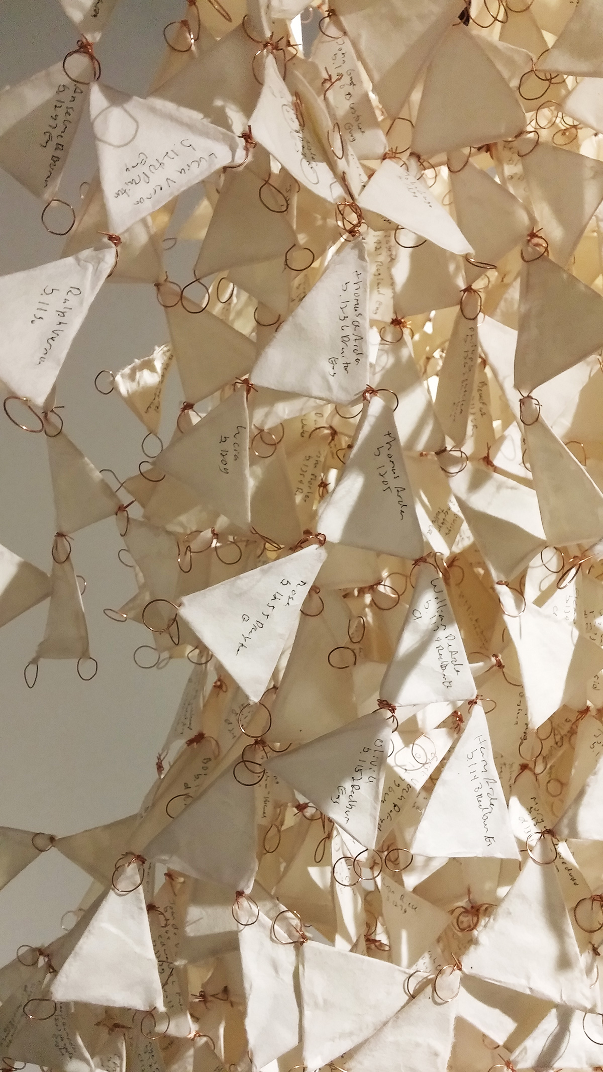
It’s contemporary, but it’s also I think very accessible, because people can look at it and get it right away, and I think that is one of the great things about it. It’s Valerie Atkisson. She’s the triangle on top, and there are all of these arms and branches that are her family members. It goes back to 7 A.D., which is kind of mind blowing.
It also has this kind of physical sense of being a double helix, in some regard, that’s very smart. And this lovely kind of sculptural quality to it. It was an easy piece to pitch. There was a lot of interest in it and a lot of excitement around it. So, that’s “Hanging Family History.” I like that it doesn’t make family history this kind of neat, organized, linear kind of tree, but rather this, I don’t know …
Katherine: It looks more like a real tree, or almost this white foliage, like a vine that’s hanging down and kind of tangled up in itself.
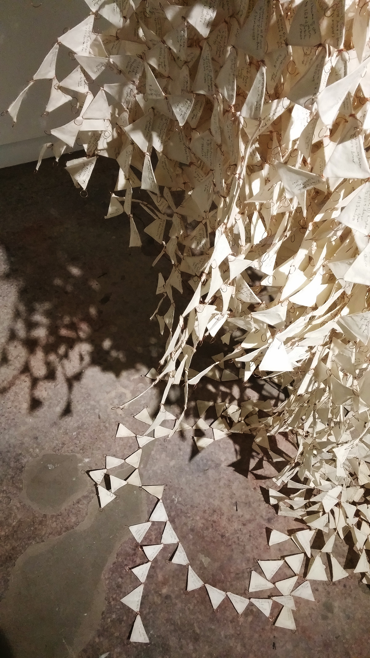
Laura: Yeah, there’s an entanglement to it that’s really lovely. And Valerie’s work in general—not just those two pieces, but almost every work she does—has some kind of reference to the intergenerational self. I think that’s certainly a Mormon concept, of understanding oneself through one’s progenitors and through not just a pioneer legacy, but through these ideas we inherited by looking back and by the people we’re connected to.
Valerie’s work is smart in that there’s this kind of clear connection—and kind of filial link between each individual piece of rice paper that’s fragile. The piece has a lovely fragility to it that feels accurate and true to the work we do in terms of genealogical research. I also love the notion—this copper wire running through; that it is these sealed little pieces over and over and over again. It’s very lovely in that regard.
And, you know, we don’t exist in this vacuum. We look back and think not only about our parents and our grandparents—but it is this sort of commandment to keep looking and keep investigating and keep searching and keep finding, because we are tied and connected. So, in some regard it’s this lovely little picture of the Granite Mountain Vault in microcosm. It’s the same kind of idea of intergenerational self.
Katherine: Yeah. I’d also like you to tell me about Ben Howell’s piece. Ben Howell’s piece is called “Transcription #1,” done in 2010. It’s ink on paper, and when you go to the museum, it’s a scroll that runs from the ceiling down to the floor. I would say the scroll is maybe three feet across, and he has written Book of Mormon verses on it. It’s very impressive, because it’s this very large scroll, and it has just lines and lines and lines of writing. So, tell me about that work.
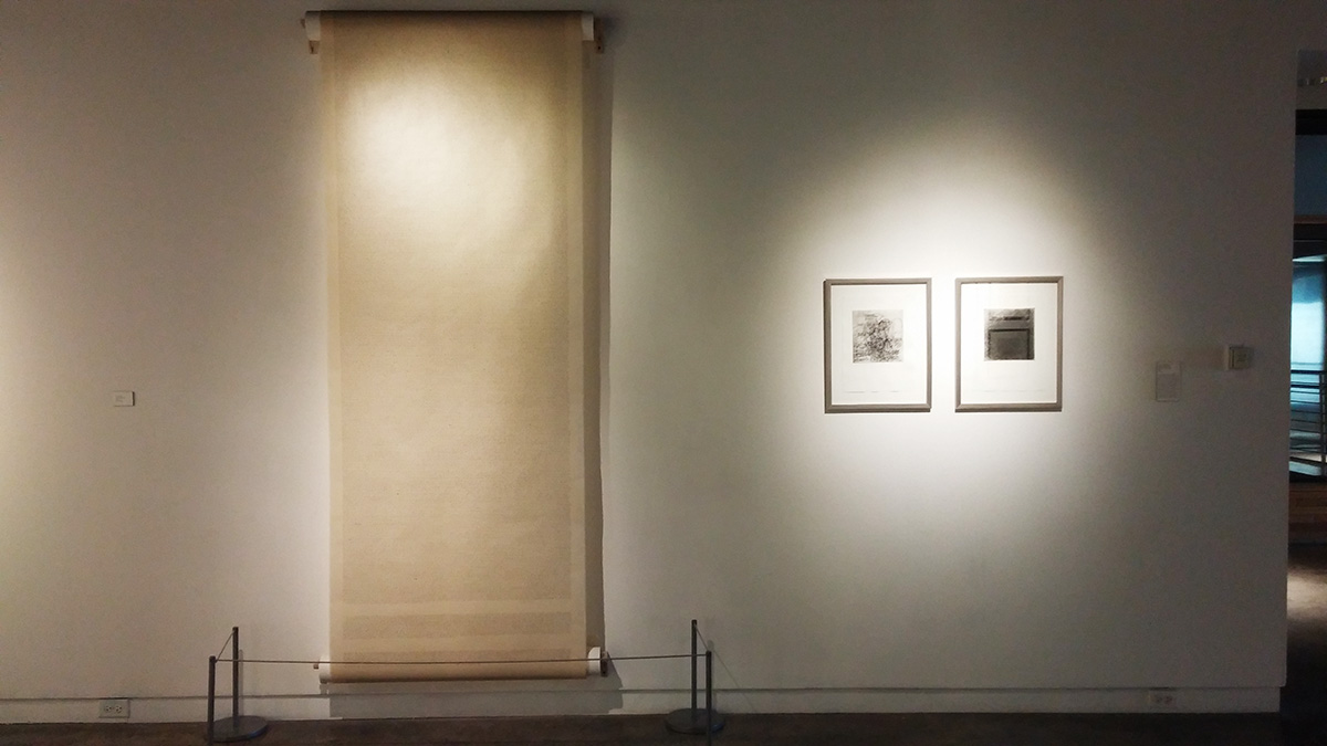
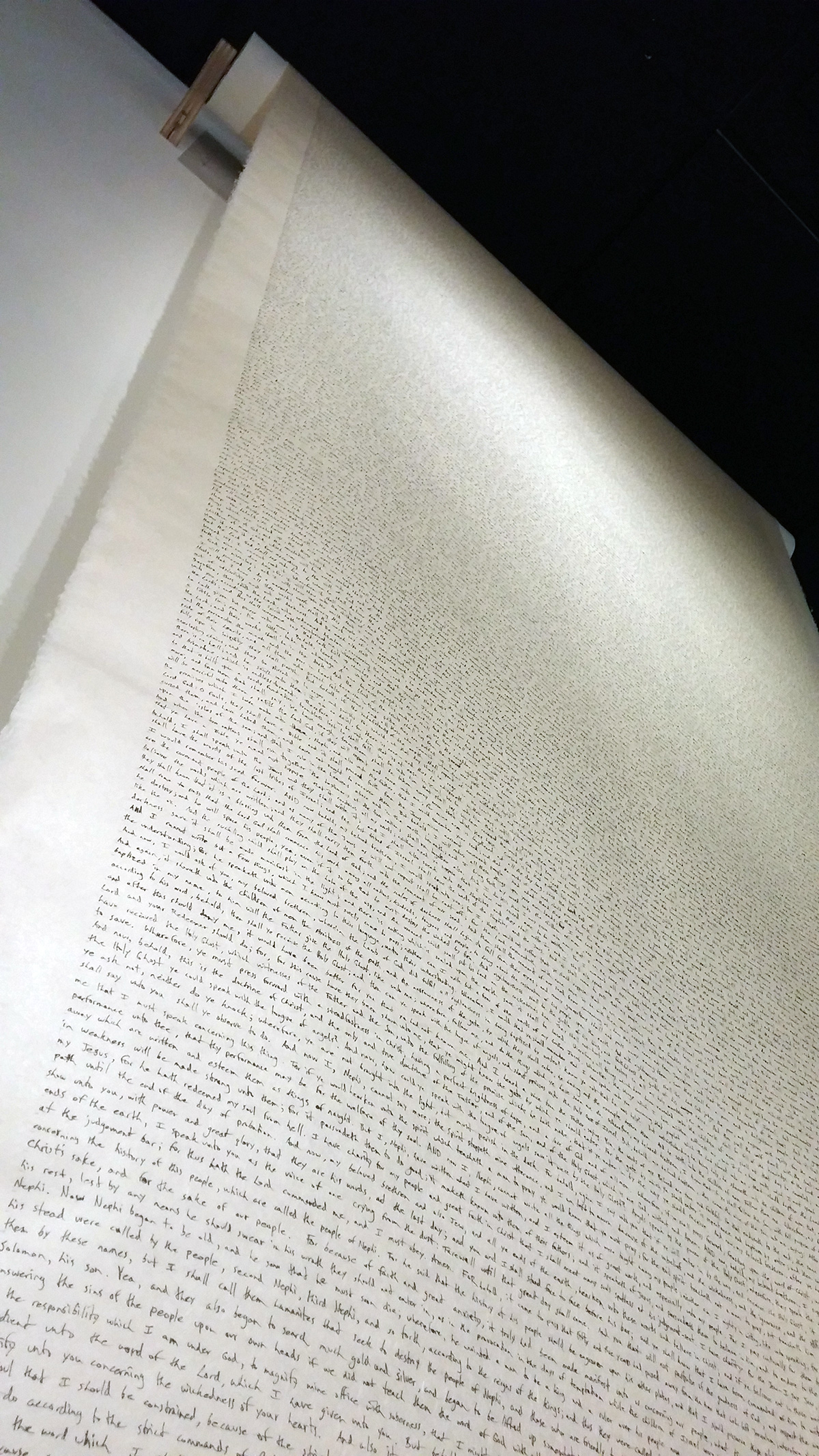
Laura: Sure. So, what you see in the gallery is one-third of its length. It’s 30 feet long, and it is a handwritten version of one-half of the Book of Mormon; so, it’s called “Transcription #1.” He’s working on “Transcription #2.” His process is very interesting. He would read a scripture, then say it out loud, and then write it. So, he tried to be very deliberate and methodical in his transcription process. It’s certainly very devotional and makes reference to scribes and medieval scribes—and also Islamic tradition, in the way that calligraphy or writing becomes a symbol for a devotional practice or devotional visual culture. I mean, his handwriting isn’t this grand calligraphy. It’s actually very—
Katherine: Scrawling—
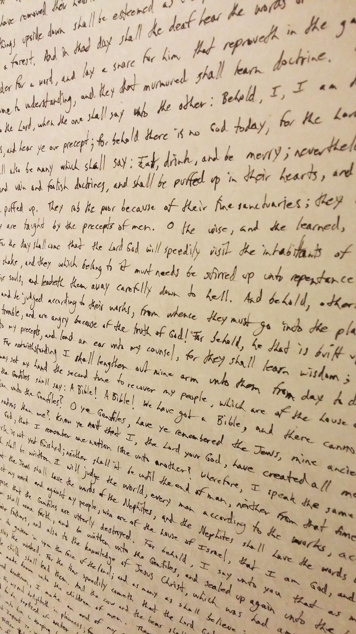
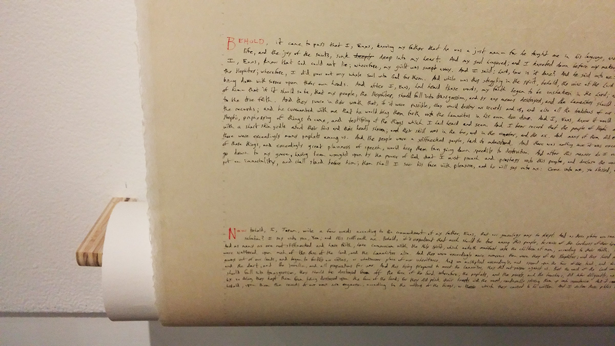
Laura: Yeah, kind of run-of-the-mill, typical handwriting of people of our generation. We grew up in the Computer Age, so the handwriting is not aestheticized.
When he made a mistake, he would cross it out and then re-write, and those mistakes are embedded in it, but they’re always corrected.
Again, also I think it makes reference to Joseph Smith. Calling it a “transcription process”—that is someone reading something and then scribing it down. Our stories of the Book of Mormon have to do with someone hand-scribing and then hand-writing, and that’s very embedded within that as well. The length of the process of hand-writing the Book of Mormon—the kind of intimacy you would get through the practice is there.
It’s also very fragile material. I had a dream after we hung it up that it was going to get ripped in half.
Katherine: Oh, no!
Laura: I was terrified. But I think that fragility is a part of the material, a part of the work. Even the notion of scrolls—there is certainly reference to scriptures being kept on scrolls and the fragility of that kind of material.
He came to the opening. Partly actually as a joke when we were—I don’t know if this is interesting, so cut this if you want—
Katherine: Well, I was actually going to ask you, because you told me that he came to the opening. And wasn’t he working on it there? I wanted to ask you about what that was like.
Laura: Yeah. He came partly as a joke, because when were installing it, it was a little challenging. The curator of education there, Jared Steffensen said, “We should just chuck this and make him re-write it in the gallery.” I laughed and then thought, “That is a brilliant idea.” Not the chucking part—but let’s invite him.
It really came together within hours. Our institution funded part of it and UMOCA funded part of it, and he came out. So, he just sat in the gallery. He used a historic table from our collection and hand-wrote very quietly in the gallery, actually. He didn’t do the reading because there were so many people there that that would be a little—a little tricky.
Katherine: It would draw attention to itself.
Laura: Yeah. And the whole museum was reopening, so there was the main gallery and four or five other galleries opening. But I think people were fascinated. It was very cool to watch the methodical, laborious, line-by-line, piece-by-piece nature of producing it.
Katherine: Yeah. Well, I would like to ask you questions about all of the pieces in that show. It’s such great work. Why don’t I finish by asking you about Daniel Everett’s “Untitled” 2014 photograph of the Provo City Temple—well, it’s becoming the Provo City Temple, but at the time it was just the Provo Tabernacle that was wrapped up. It was in this transition process.

Laura: Yeah, I think on my label I called it “The Provo Tabernacle Temple,” because I liked that name better than the Provo City Center Temple. I thought it was more accurate. But I don’t get to name temples
Katherine: Well, that name reflects the kind of transition.
Laura: Yeah.
Katherine: The neat thing about the photograph is that when you look at it—I mean, you could say that it’s in the genre of temple photography. But looking at it, you wouldn’t know that immediately, because to me when I saw it, it looked like an abstract, geometrical work of art or photography. It wasn’t till I read the little write-up of it that I realized that it was the Tabernacle. And then I looked at it again and saw that it was. But it’s hard to tell because it’s wrapped up in some kind of sheet that has stripes on it, blue and white stripes.
Laura: Yeah. It’s wrapped in Tyvek. I loved that kind of masking of it. It looks sterile—I loved the kind of sterile look to it. There’s even these very sharp blue and white lines throughout it. It’s under construction—it’s in process. It’s again that mundane kind of thing, and it’s also a building that’s vulnerable to flames and vulnerable to time. You see that in the building. In some regard it felt like David Chapman Lindsay’s hand drawing of the temple, where it’s very much about the physicality of it and the building of it—and the process of it being built. And yet it’s in all of that and in all of our efforts that that’s how temple work occurs and happens—is in the building and in the process and in that kind of work. And I liked the duality to it. It seemed to very much explore that notion of the mundane and the sublime, that it is this building in process—and that we are a people in process. I liked that multiplicity to the image.
Katherine: Okay. Well, we don’t really have any more time, and we haven’t even gotten to the Church’s upcoming International Art Competition. But you’re getting your submissions all in for that today. Today’s the deadline. So, we might have to do another interview with you when that exhibit is up and ask you some more questions about that.
Laura: Yeah, that would be great.
Katherine: Thank you so much for your time.
Laura: Yeah, thank you. I’m sorry I talked too long.
Katherine: No, it was very enjoyable. There aren’t a lot of people out there who know a lot about Mormon art, especially contemporary Mormon art, so it’s really great to have a source to discuss that with.
Laura: Well, thank you. Thanks so much. This is great. I had a good time. ❧
