
Episode 7: Joan Layton Merrell, calligrapher
Show Notes
In this episode, Mormon Artist host Katherine Morris interviews calligrapher Joan Layton Merrell. They discuss Joan’s previous works accepted for the LDS Church’s International Art Competition, the papercasting technique she developed and teaches, her upcoming book The Olive Tree, and what an illuminated Book of Mormon might look like.
- Interview date: January 16, 2015
- Joan’s website
- Saint John’s Bible
- Note: Podcast music and sound by Saint Roxcy. Copyright © Saint Roxcy 2015. All rights reserved.
Transcript
Katherine Morris: Welcome to the Mormon Artist podcast. Today we’re speaking with calligrapher Joan Layton Merrell. Hi, Joan.
Joan Layton Merrell: Hi! It’s good to be here.
Katherine: Joan Layton Merrell graduated from Brigham Young University where she studied art. She has taught calligraphy for 20 years at community colleges, art galleries, and for calligraphy guilds across the United States.
She’s been on the faculty of five international lettering conferences and on the Board of Directors of the international Association for the Calligraphic Arts for several years, including four as president.
Her work has been included in a number of publications, including Letter Arts Review. You can find her website at letterdesignstudio.com. She currently resides with her family in Jefferson City, Missouri.
Well, Joan, today you’re not in Jefferson City, Missouri. Today you’re in Utah. What’s the occasion?
Joan: Well, one reason I’m here is to meet with other members of the Utah Calligraphic Artists, who are sponsoring an international conference in 2017, and I am co-directing that conference.
Katherine: Oh, interesting. Where is that conference being held?
Joan: It’s going to be at Weber State University. There are usually people from all over the country and occasionally from Australia and Japan and Europe.
Katherine: Wow. So, I don’t know a lot about calligraphy. I’m guessing a lot of our listeners don’t. It’s one of those arts that seems like it has a pretty long tradition, but it’s not necessarily something you would major in at a university.
So, how did you get into the craft and learn it?
Joan: I first got introduced to it in high school with a commercial art class. The teacher did an alphabet on the board and said, “Go buy a Speedball book and try this out,” which wasn’t a lot of help—but it was fun, and I’d try things out.
Then, many years later when I had a fourth kid at home and was looking for something to do, I got back into it. And then I discovered calligraphy guilds, which are groups around the country that bring in people to teach workshops. So, I learned a lot through calligraphy guilds.
In North Carolina there was a place called Camp Cheerio, where they often had week-long workshops. And then I found out about these international conferences. It’s almost all done through workshops. Once in a while you can find an evening class or something.
Other than that, there may be two places in the country that actually have degrees that relate.
Katherine: So, how long does it take to develop the craft? And is there something that you have to do to be part of the guild, other than register?
Joan: I was nervous about that when I first found a guild, but most of them are happy to take anyone with any interest. There’s not a requirement. There is a group in England that invites you if you’re good enough.
One of the good things about calligraphy in a sense is that most people aren’t familiar with it enough to know if you’re really good. So, when you start, people go, “Oh, that’s really pretty,” and that’s encouraging. And you can keep going.
There are a lot of different levels. Most people don’t know there’s a professional level of lettering art. I’m not at the level of those who do it all the time full-time—but definitely good enough that I do do work I consider professional work in most cases.
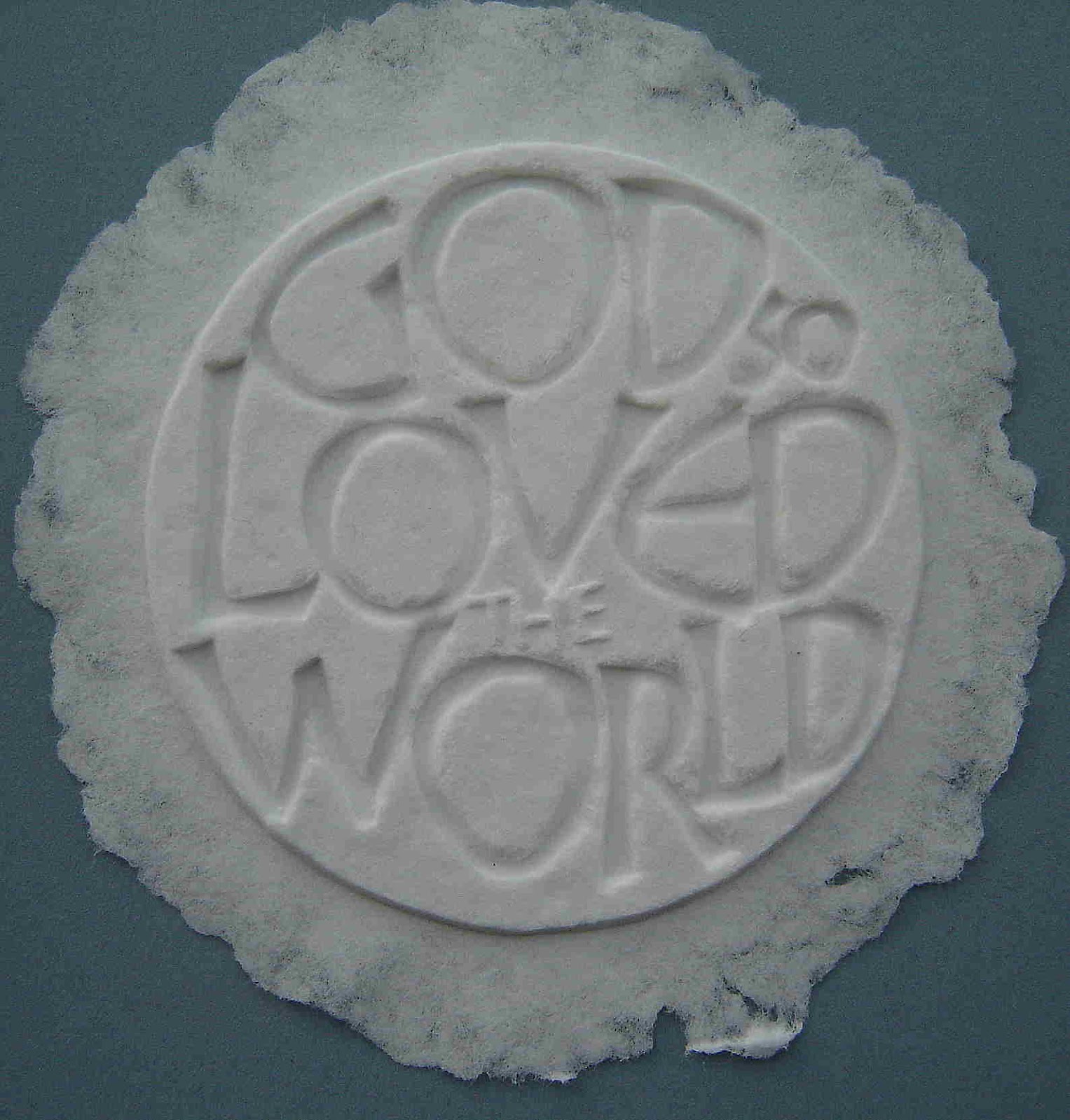
Katherine: You’ve developed a particular technique called papercasting that you’ve taught at workshops and conferences. What is that, and how did you develop that technique?
Joan: Well, basically, I make a mold and make paper pulp and cast it.
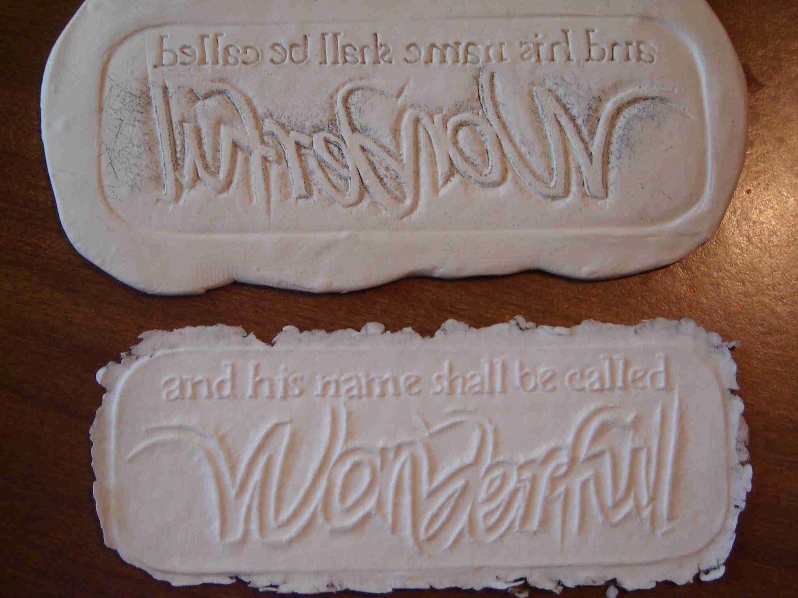
At one point I was introduced to dry embossing, where you just push the paper down into a stencil to get it raised. It’s really pretty, but you can’t see it from far away.
When I heard about papercasting, oh, probably about 20 years ago—it was a popular craft where people used cookie molds and things. I heard about that, and I tried using it for a project in a class I was taking. Being a calligrapher, almost everything I do, I end up thinking, “Well, how can I incorporate letters into this?” You know, I’ve kind of got back into oil painting, and I’m—“How can I put letters into this?”
Anyway, I couldn’t find any good way—when I looked up methods of papercasting, nothing seemed to work well for letters. So, I finally just invented a method that I’ve been developing for over 20 years now—where I cut molds out of polymer clay with the lettering. Then I make the paper pulp in the blender and basically press it down into the mold. And then you have your words made out of paper. It’s kind of a white-on-white, and it can be quite deep, so it doesn’t disappear like embossing. It looks pretty elegant.
Katherine: What are some of the pieces that you’ve done with it?
Joan: One of the most popular ones is a saying you’ve probably heard, William Morris’s saying: “Have nothing in your houses you do not know to be useful or believe to be beautiful.” It’s just done like that as a saying, and I’ll cast it with various pale shades of different colors and things.
So, a lot of what I’ve done is kind of the simple ones of a quote. I’ve also done a few—I have a tower. It’s—well, the height is the width of my oven, because you have to bake the mold. So, it’s about 23 inches high with four sides, and it has lettering. One side has the scripture on it, “I’m the life and light of the world,” and then the top has a sun. One side has, “This is my work and my glory,” and it has a temple. Then it’s sewn together—these four sides—to make a tower. I had someone build me a nice wooden base for it.
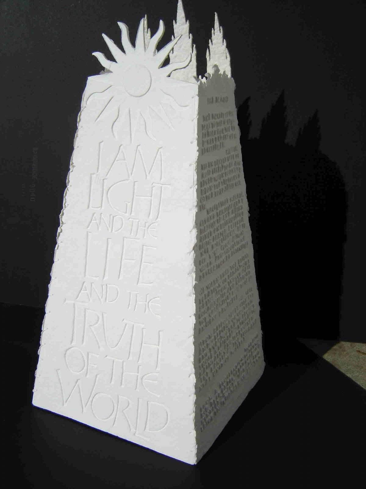
So, that’s one of the more ambitious things I’ve done. I’ve done a few three-dimensional bowls and things. But most of them have been flat. I’ve done a nativity that has a picture—Joseph, Mary, and the baby—but then there’s writing. As Mary’s robe comes along, there’s some scriptures about Mary and Jesus. So, it’s combining the words and picture, but it’s all cast in white paper.
Katherine: How long have you been teaching that technique?
Joan: I think the first major time I taught it was at a conference in 2001 in Boston. I was almost ready to give it up because some of the molds I made were so difficult to cast, it was a real pain. Then when I got asked to teach, it sort of fired me back up. So, every time I teach at a major conference, I usually come up with a new idea and a new method, because I really get thinking about it some more.
Katherine: Well, let’s get into some of your specific works. You’ve submitted twice to the Church’s International Art Competition and have been accepted both times. So, let’s talk about those.
Your work that you submitted in 2002 was called Women of God. I believe you said—we were talking about this earlier—it’s made from acrylic ink, gouache, and colored pencil, and it’s on canvas.
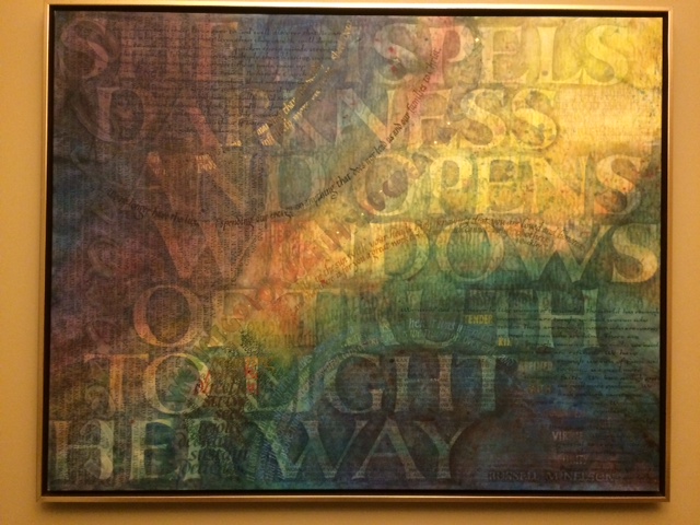
To describe it to our listeners, it’s a piece that is really colorful. It has some blues and purples and reds and yellows. The yellow is kind of in a streak diagonally down the middle of the piece. Then, on the opposite corners, there are blues and purples that form two spheres. And then there’s text layered all throughout the piece—some large, some very small. You drew from The Family: A Proclamation to the World and also declarations by the Relief Society and quotations from several Church presidents and women’s leaders.
Tell me about the technique you used and the texts you worked with and the symbols in the piece.
Joan: I worked on unstretched canvas, and I started with just background washes, because I wanted to make sure I got that look with the light coming through. So, I used watered-down acrylics and acrylic inks to just put a wash on. Then I just kind of started writing. I’m not real experienced with brushes for lettering, so I was doing this with metal pens on canvas. I was surprised to find that I could even make it work with a pointed pen, because I wasn’t sure that would happen.
I basically just took text I wanted, and I would pick the one that seemed most important to me at the time and just start going—and do a big column of writing. I’d pick the next one and—where did I think it needed to go? So, it’s kind of all step-by-step.
There were some places with large writing where I would lay down the lettering and then use a rag or something to mop some of it off so it’s kind of transparent. There’s gold leaf going through a line in the middle to be part of that light that comes through. Some of the writing is sideways. On the upper left there’s very small black pointed pen that you’d have to tilt your head to read.
Most of the quotes are done so that you can read enough of it—you can’t necessarily read everything on it easily; but either it’s repeated, or the important points I wanted can be read. So, if you wanted to, you could stand there and spend a long time finding all sorts of things you could read. Or you can just glance at it and pick up bits and pieces.
The really large lettering that covers the whole thing came about at the end when I decided it was too scattered, and I wanted to tie it all together. Some people think that was first, but it was actually last. I actually designed and transferred the really large letters, and then just darkened all around them.
Katherine: How did you transfer those on to the piece?
Joan: Saral transfer paper. That is kind of like carbon paper but comes with different colors and things. So, you just lay it underneath and trace over it, and it leaves in this case yellow—a little yellow line that can rub off. Then I just went in with my paints. I watered down, very watery, the different ink store paints and darkened around the outside of all the letters. Some I went over several times until it was enough that you could really see those words.
I’ve always loved that quote about “She opens windows of truth,” so that was one that to me tied the whole thing together thematically as well as actually visually.
Katherine: There are a couple of things I wanted to talk about in that work. The spheres in the corners—I think in the artist statement or in the statement that they had in the Church’s exhibit—it said that it was representing premortal and earth life moving upward to eternal life. Was that something you had figured out the composition of when you started—that you were going to put in those spheres like that?
Joan: You know, I actually don’t really remember. I remember wanting to make sure I had that light coming through, and that it kind of represented earth. So, probably yes. My memory is not what it used to be.
Katherine: Well, it was 2002, so this was some time ago.
And the process of choosing the texts—did you start out with knowing what you were going to use, or just picked a few at a time as you thought of them or were inspired by them?
Joan: A lot of the pieces I’ve done like this—I kind of feel it’s like my scripture study. I’ll get a topic in mind, and I’ll just go look up all the things that I can find—or, in this case I’d been collecting things for some time. I’d done some other pieces that had to do with things about women and being women of God. So, I already had kind of a pile.
So, I’ll search out a whole bunch of things, and when I sit down to work on it, I’ll just flip through that whole pile and see what strikes me right now. Sometimes I’ll start out with one or two things in mind that I know are going to be the main things. And sometimes I’ll start with, well today this one strikes me—and I’ll just start writing it.
Katherine: Okay. And then in 2012, you did a work that was in the Church’s show, called All Things Denote There Is a God.
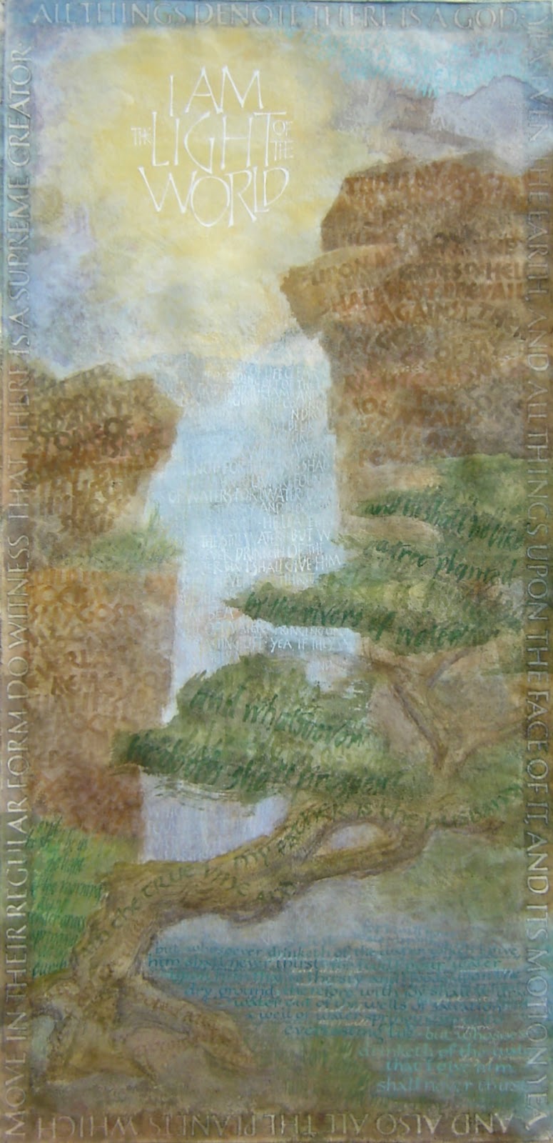
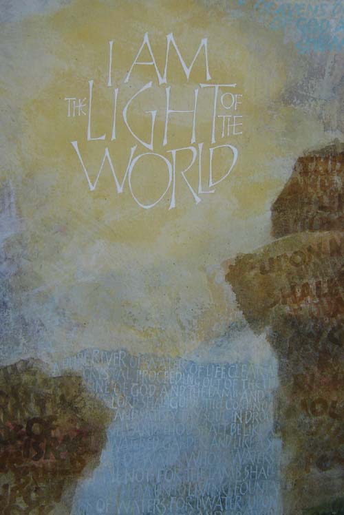
The technique was similar—you used acrylic ink, gouache, colored pencil on canvas. But it’s a little bit different in that the text forms a more clear picture with a tree and a ravine or a canyon that a river is running through. And then at the top—it’s a long piece, vertically—and at the top there’s a yellow sun. The text that you have going around the perimeter is “All things denote there is a God; yea, even the earth, and all things that are upon the face of it …,” which is from Alma 30:44 in the Book of Mormon.
And then there are other little bits of text in the picture. There’s some in the tree and some that make up the river. And then the sun—the text is “I am the light of the world.”
So, tell me about making that piece.
Joan: That one was planned from the beginning based on that scripture, because I was really struck by that “All things denote there is a God,” and so I wanted it to be more representational—so, you saw “the things.” What “things” are you talking about? The tree has scriptures about tree and root and “I am the true vine.” The water is all scriptures about water—“the water of life,” “I shall be unto you like rain on a thirsty garden.”
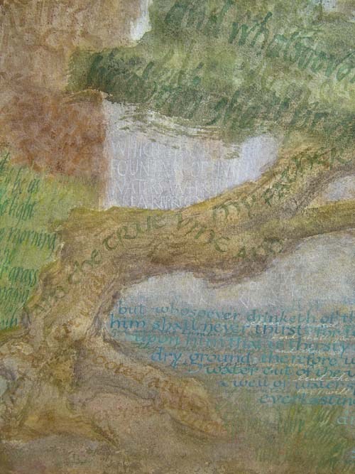
That was what I started from was that concept—that I wanted there to be rocks and trees and water and sun and actually then have those scriptures written on those things. So, it’s kind of a visual representation of what that scripture is saying.
So, it was a little more planned from the beginning—that this would be a picture with a tree in it, etc. I did that basically first and then just started writing. Some places I didn’t like and I would wash off the gouache, or I would paint over and do it again until I got it all to work. It was probably more planned. The writing around the outside wasn’t part of the plan originally, but I felt like it really needed that to tie it in, and I liked having the scripture right there around the edge to I guess help make sure people are getting what it meant.
Katherine: Yeah. Well, that’s funny hearing the process, because, like the other piece, you said you put the larger text on last, but people thought you put it on first. I definitely thought that was the case.
And then in this piece, I just assumed that the perimeter was something that—if not something that you painted first—was something that was kind of the first idea that you were working with. Because that’s the title of the piece and that’s the text that you’re working with. That’s interesting to hear about the creative process.
Joan: It actually made it tricky. I had to get really close to one of the edges of the canvas I was working on, because I hadn’t really planned on it.
Katherine: So, how do you choose the texts that you’re going to work with?
Joan: It depends on what sort of piece, but a lot of time that’s just what I start from. I start from a text or idea. Like I really like this scripture—and what other things may go with it?
A lot of times in the calligraphic community, they’ll talk about how you should be working with texts that mean something to you. I find a lot of the time that’s the scriptures. I don’t feel there are a lot of other things that are as deep or as well-written as the scriptures are, so I tend to use them a lot.
I like to do something that make good wedding presents, so what’s some text or scriptures that would be really meaningful to somebody getting married? Just that sort of thing.
A lot of time, like I said with the Women of God, I just end up with this big pile. I print it out and start looking through to see what strikes me at the time as being really meaningful or important or helpful.
Katherine: Okay, so another project that you’ve been working on is a book that you and your two sisters wrote and illustrated. It’s called The Olive Tree, and it’s being published by Cedar Fort.
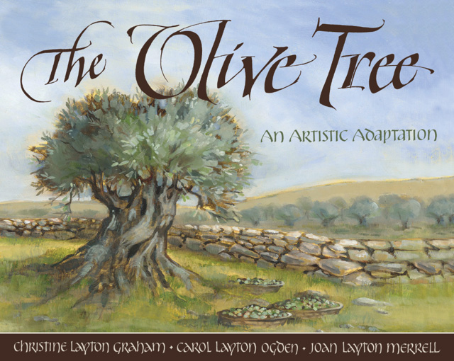
So, tell me what the book is about and how you came to collaborate on that project together.
Joan: Well, it’s been really fun. My older sister, Christine Graham, is a writer. She had this idea several years ago to do something with this story from Jacob 5, because the olive tree is mentioned a lot in the scriptures. But Jacob 5 is really kind of long and complicated and repetitious in places, because of the Hebrew thing where they repeat.
She had this idea to do a book of it, and she asked me to try writing some of it out in calligraphy, because she was thinking of an art book. I did some samples, and then I don’t know how long went by. She tried it again, and then, finally, all of a sudden we found ourselves with a book contract.
Christine did the adaptation, my sister Carol did paintings for the illustration, and then I had to—really fairly quickly, actually—letter up the entire text. It happened a lot faster than we expected when it finally happened.
I had never worked with an art director and an editor, so it was a very different thing for me. Usually, I’m doing a piece and I can sit down and do a layout and think, “I should maybe emphasize these words” or “It would balance better if I made this line bigger,” you know. I not only had to deal with the parts—the editor would decide which phrases we would emphasize. Then they decided where to divide the pages, and the art director had things we needed to do. I had to take all of what they wanted and manage to do the pages so they all went together and looked enough alike. The layout was the new challenge for me—working with all that stuff.
Hopefully it works. I haven’t seen the finished yet in hand. I’ve only seen online pictures of it. I hope it works. We learned so much, I’m sure if we did it over again, today we’d do better—but that’s normal. But we did certainly learn a lot working, and Carol’s paintings are wonderful. It’s been pretty exciting to see her do that.
Katherine: What are some things you had to take into consideration collaborating with other artists?
Joan: One of the things was when I first did those trials a few years ago, I sent them to Carol, and she used colors from my pages—the paper and the lettering—to start painting. And then when we got doing it, I could no longer get the paper I had used. So, the paper was a different color.
She was working in Utah, and I was working in Missouri, and we wanted to make sure the colors I used went with the colors she used. And you scanning on your computer really aren’t true to color. So, we did a little mailing back and forth of paint samples and paper samples.
So, that was one of the things. In fact, I pasted up printouts of her paintings on a wall and looked at them with each page, because I wanted each of my pages to go with the painting opposite it. They liked the idea of having the color variation, but I wanted to make sure they went with each page. So, that was new too, and hopefully that worked.
Katherine: When is the book being published?
Joan: It comes out in March. So, pretty soon.
Katherine: Well, that’s really neat. You’ve done several things with Book of Mormon text. This is a topic I’ve been thinking a lot about—the Book of Mormon text and the aesthetics of the Book of Mormon.
A lot of people talk about the historicity of the Book of Mormon—DNA evidence and that sort of thing—and have things to say about that.
But there was an interview where Richard Dawkins—it’s kind of notorious—where Richard Dawkins and Brandon Flowers of The Killers were on a Norwegian talk show. One of the things Richard Dawkins said that bothered me more than any of the shots he took at the authenticity of the Book of Mormon was that he said, “It has no poetry; it has no beauty.” That’s what he said about the Book of Mormon.
And I thought that was really interesting. Of course, he then acknowledged that he hadn’t actually read it. So, we could say a lot about that. But what was interesting about that was it wasn’t an idea that was original to him. He was getting a lot of his ideas from things he’d heard from other people.
I don’t know what the origin of this is, but I think ever since Samuel Clemens—Mark Twain—talked about the Book of Mormon in a rather disparaging way, saying that it’s “chloroform in print” and that if you took out all of the and-it-came-to-passes—
Joan: It would be a pamphlet.
Katherine: —you’d have nothing more than a pamphlet. I think there’s been this kind of prevailing idea among non-Mormons—and I’ve even heard it among some Mormons, which I find a little more concerning—that the Book of Mormon isn’t beautiful.
I’ve heard it from scholars, even scholars who teach the Book of Mormon. I heard it from a Catholic scholar who really likes the Book of Mormon, actually. He thinks it is a really very Christ-centered text. But he makes this concession; he says, you know, it’s not beautiful.
Anyway, what do you have to say about that? You’ve worked with the Book of Mormon text in your artwork. So, I was just wondering if you’ve had any thoughts on that.
Joan: Well, that’s interesting. That’s interesting. Yeah, and I taught Book of Mormon in seminary last year. Um, wow, I disagree. There are some beautiful things, but that is interesting.
I have actually tried a few years ago—I’ve tried to gather some Mormon calligraphers online and do some Book of Mormon projects that could maybe build to an exhibit, even if it was online. We didn’t get very far. But, wow, that’s interesting. That makes me want to try again and do some exhibits of some beautiful things from the Book of Mormon.
I have often thought, if I had millions of dollars, I would get a group together where we do something like the Saint John’s Bible, where we even just took the Book of Mosiah and did a gorgeous book of it.
Katherine: What is the Saint John’s Bible?
Joan: The Saint John’s Bible is the first handwritten, completely handwritten and illuminated Bible in 600 years. It was sponsored by the monks of Saint John’s in Minnesota. It’s huge, seven volumes, took a whole bunch of calligraphers. They brought in artists and put together this absolutely gorgeous Bible.
One reason they did it is because the Benedictine monks have this—I can’t remember the name, I’m sorry—a way of reading that basically means to read slowly and ponder what you’re reading. They felt like a hand-lettered Bible slows down your reading so you appreciate the scriptures as you read it.
It’s a beautiful work. It took years.
Katherine: So, that was a collaboration among calligraphers—professional calligraphers? Some of them would take a passage and work on it and others would take another passage and work on it?
Joan: Donald Jackson, who’s the scribe to the Queen of England, was in charge. They planned it all out—they worked on a style of writing; everyone was trained to write the same. It took—I think it was about ten scribes, and they would assign them out pages. Then they brought in someone who did illustrations of birds and butterflies.
The hard part was this all went through committees at Saint John’s, so they had to design by committee. It’s very organized, and it’s not like different people did different kinds of things. It just took that many people to do it.
There are several facsimiles around that you can see—and you can see several things online. It’s done somewhat like a medieval Bible in that it’s all done on parchment with illuminations. And yet it’s also got a lot of modern touches to it. It would be really fun to do something from the Book of Mormon that way—decide what would you do modern.
I actually have a Book of Mormon project I started years ago that’s been on the backburner many years now. Excerpts from the Book of Mormon—to take just some bits from the Book of Mormon, do them like the scriptures would have been in the Americas.
In Europe there’s medieval Bibles, but in America we don’t have much of anything from hundreds of years ago because the Catholics burned all the codexes they could find because they thought they were heathen. So, there’s very few, but they had bark paper, accordion fold codexes.
That’s probably what, if people had had the scriptures here six hundred years ago, that’s what the Book of Mormon would have been—an accordion book on bark paper with beautiful greens and blues and outlying pictures and things. I’ve been tracking down the right kinds of papers and things to try to do a project like that—you know, maybe what Alma’s scriptures were like that he carried around. Sort of an American version of a medieval scripture.
I don’t know if it will ever happen or not. Someday it might.
Katherine: Well, that’s interesting.
Joan: That did veer a little bit from your question.
Katherine: No—well, that’s very interesting.
What would you imagine an illuminated Book of Mormon would look like? You mentioned Saint John’s. What would be some unique touches to it?
I’m picturing Sego Lilies in the borders and Deseret Alphabet included somewhere in there.
Joan: Oh, what good ideas. Good ideas. I think those are great. I don’t know—I guess I haven’t thought far enough, maybe, of what kind of touches could be used.
I think using things from Church history would be really neat, and different things that have to do with Latin America or North and South America (you know, we don’t really know for sure where was what).
It would be interesting to pick things that go along with the stories. What could you think of to illuminate that would tie in with, say, the barges coming across in the Book of Ether, and oceans and things?
Katherine: Oh, yeah. With the glowing stones.
Joan: The glowing stones, there you go—there’s your gold leaf on gum ammoniac, or something. Or, what is it—palladium—that’s even whiter.
Yeah, there are a lot of options. It could be pretty neat. But doing the whole book would be a huge undertaking. Saint John’s Bible I think probably cost seven million or ten million dollars or something by the time they were done.
But it could be a piece of it. Maybe just selected favorite pieces from the Book of Mormon or something. There are quite a few good Mormon calligraphers out there. We could get them together.
Katherine: My last question is what are you working on right now, or what do you have coming up?
Joan: I’ve hit that time of year where all of a sudden I have paying clients. So, that’s just certificates and diplomas and that sort of thing. That’s what I’m going to be doing for the next couple of months.
I’m trying to think of what are in my notes that I really want to do next. I do have three started canvases rolled up in the corner. See if I ever get back to them.
Katherine: What are the texts that you’re working with on those?
Joan: One of them is basically about Christ. I was partly experimenting with writing really large and then writing other smaller things over it—a little bit different way.
One of them I want to do is kind of about the spirit and feeling the spirit. I want the canvas to be mostly white and the lettering almost just peeking out here and there from shades of off white. I have no idea how that will work. I haven’t really collected what I wanted to say—it will probably be a lot of quotes about revelation and things.
Katherine: It sounds like you have a lot to work on.
Joan: If I could do all the ideas that came through my head, I could have quite a pile of stuff done. But then life intervenes.
Katherine: Right. Well, thank you so much for joining us.
Joan: Well, thank you. I’ve really enjoyed it.
Katherine: Okay. ❧